Jordan Campbell · Director of Product Design & AI Operations at Inbox Health
Hibernate Sleep
Brand system and app redesign for a sleep tech startup.
Design Lead, Brand Experience · 2021-2022 · Digital Surgeons · Hibernate
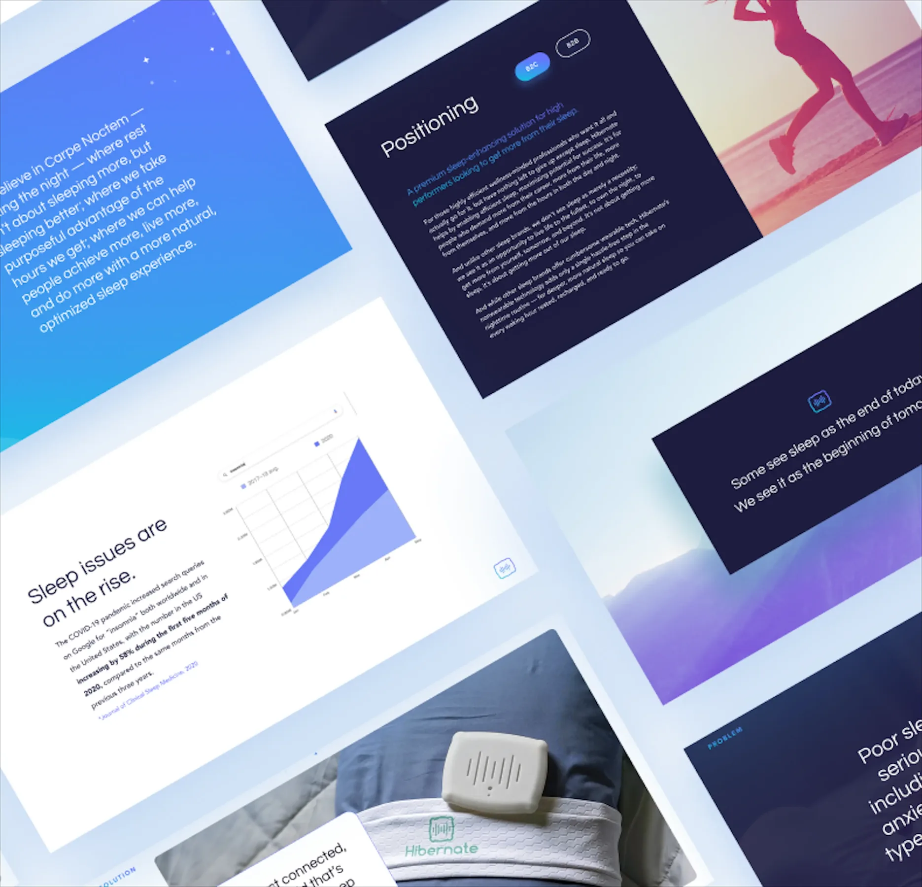
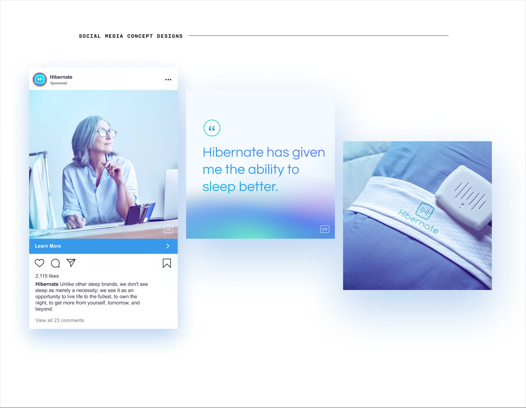
Hibernate had a strong product but a fragmented brand — inconsistent visuals, no clear story, and an app that wasn't converting to premium. I led a week-long design sprint that unified the brand across every touchpoint: logo, color palette, app redesign, packaging, pitch deck, and social.
Results
- Complete brand system across app, web, and packaging.
- In-app upselling opportunities introduced.
- Unified visual identity across all touchpoints.
- Direct praise from CEO & Founder on brand messaging accuracy.
The difficult part
What shaped the work
I led a week-long design sprint to unify everything.
Who I worked with
Feedback was internal only — no founder pushback on the logo refinement or the in-app upselling. The pressure came from inside the team: when a team member couldn't contribute, I pulled a few all-nighters so we still made the deadline.
The Problem
Hibernate had a strong product but a fragmented brand. Inconsistent visuals across touchpoints, no cohesive story, and a mobile app that wasn't converting users to premium. I led a week-long design sprint to unify everything.
Brand Strategy
I started with the founder's story — his realization that sleep was a competitive advantage, rooted in the restorative rest he found at sea. That became the narrative backbone. From there I defined the target audience, visual direction, and brand positioning for the connected wellness space.

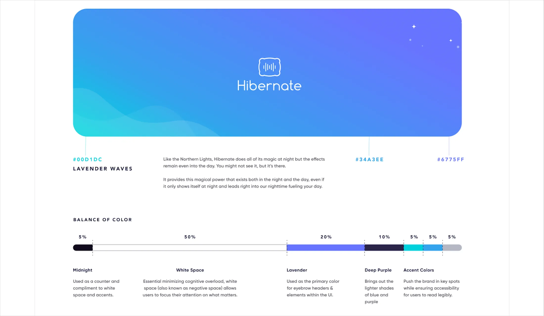
Logo & Color
I refined the existing logo — simplified it to match Hibernate's focus on efficiency while keeping its original character. The color palette paired soothing tones for sleep with sharper accents that conveyed performance.
App Redesign
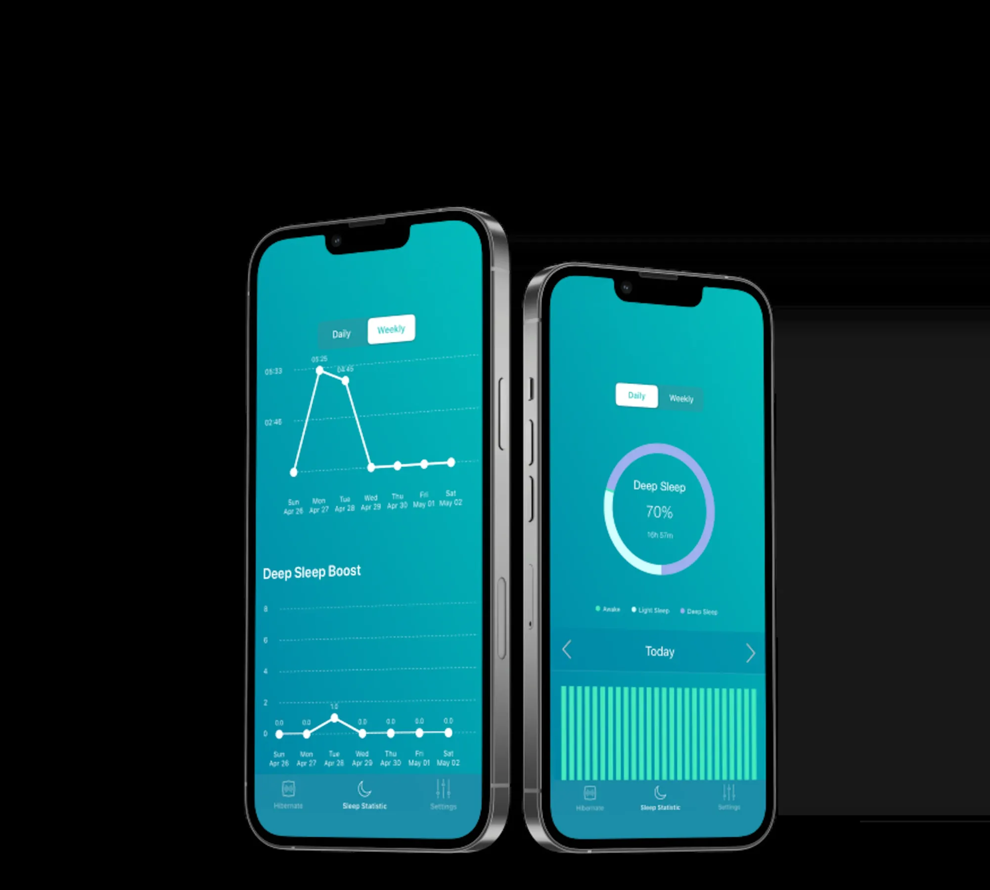
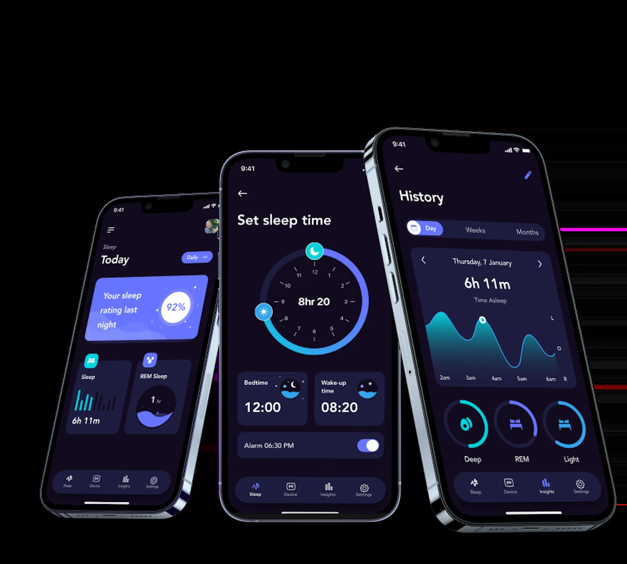
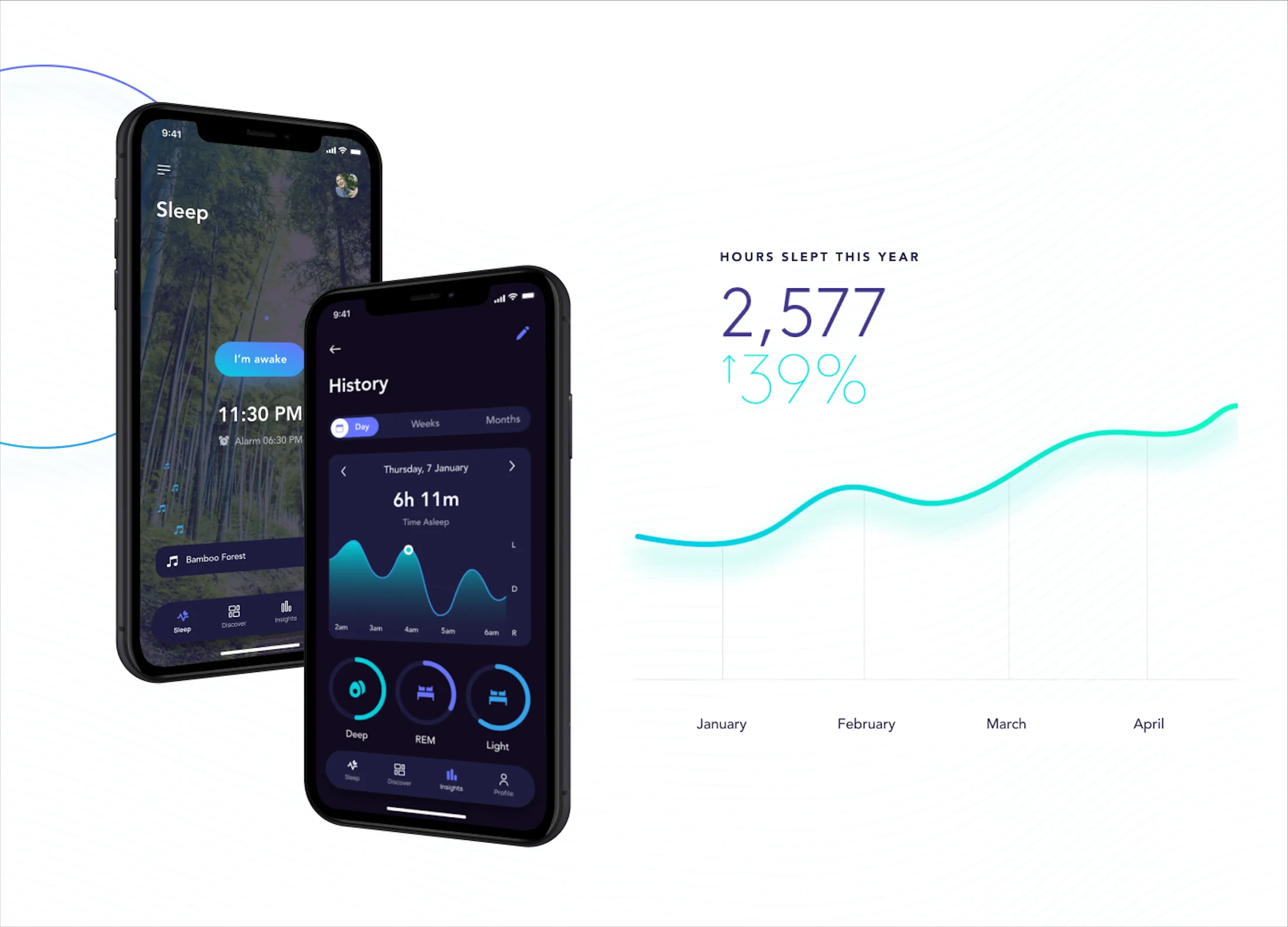
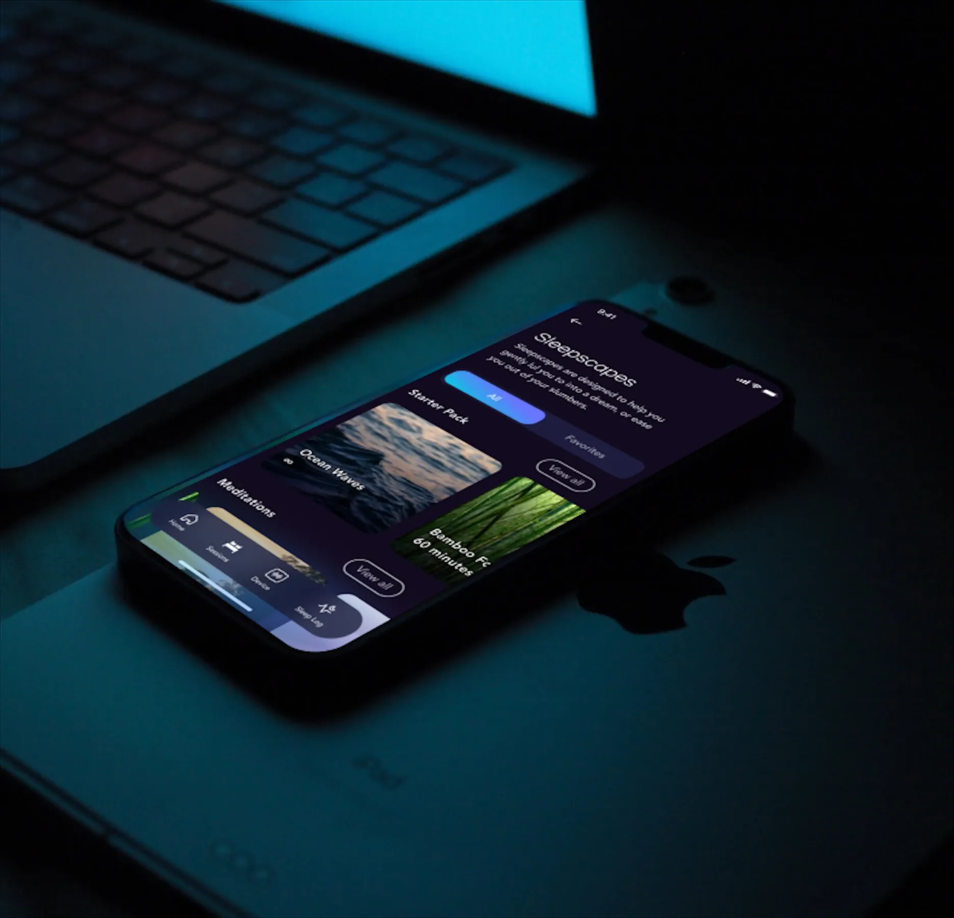
I redesigned the mobile app and introduced upselling opportunities within the interface — something the previous version didn't have. The redesign connected the product experience to the new brand identity.
Touchpoints
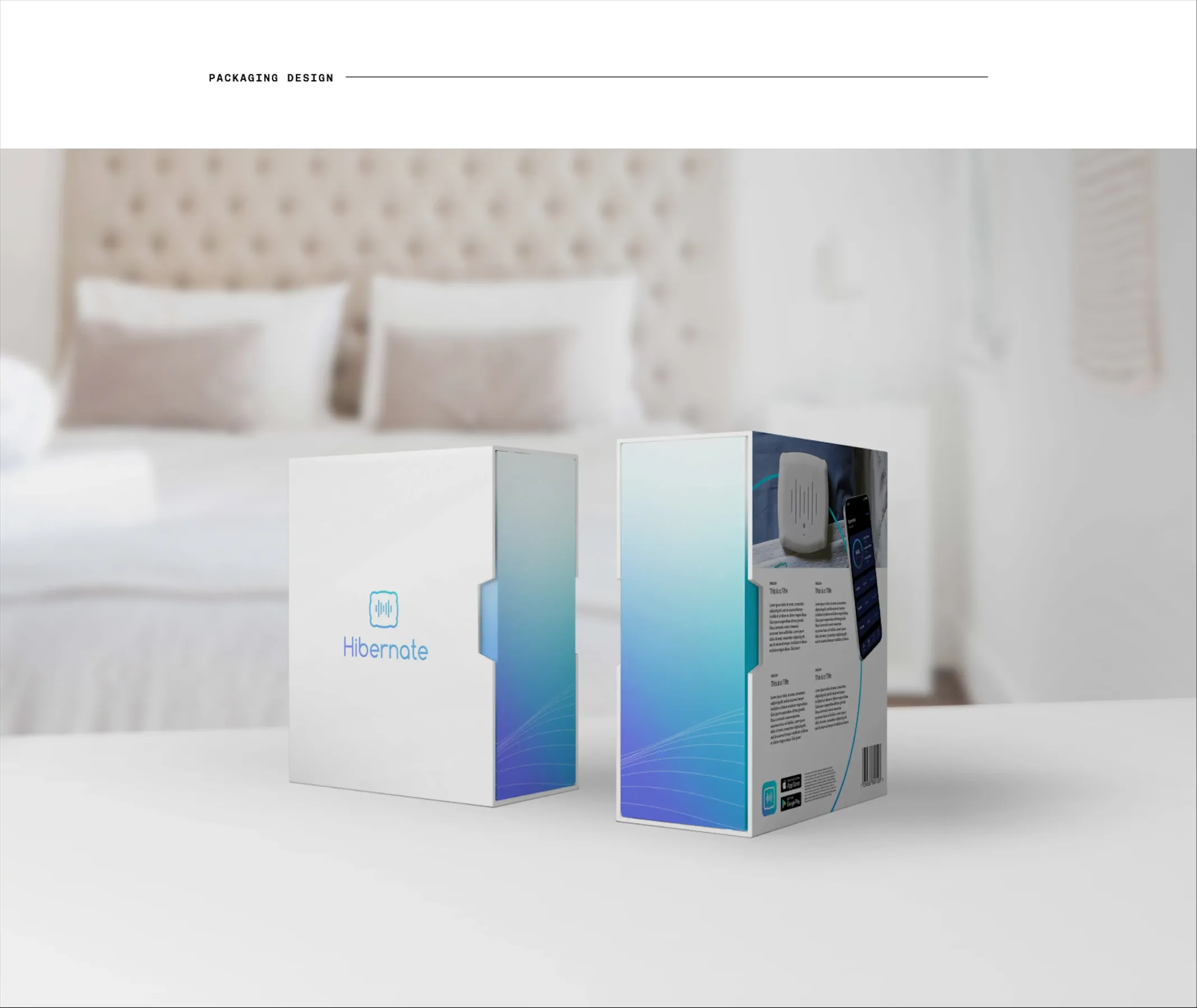
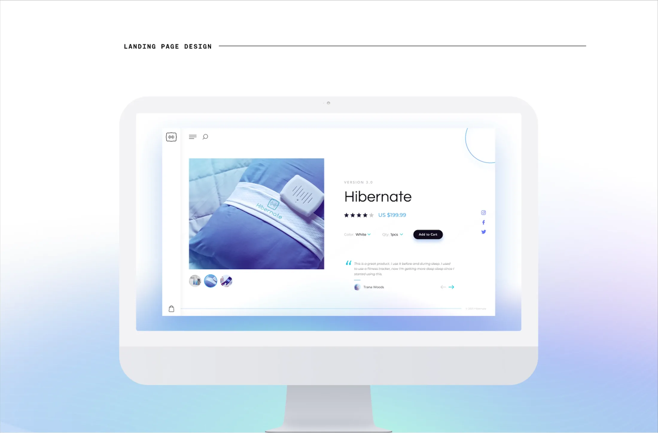
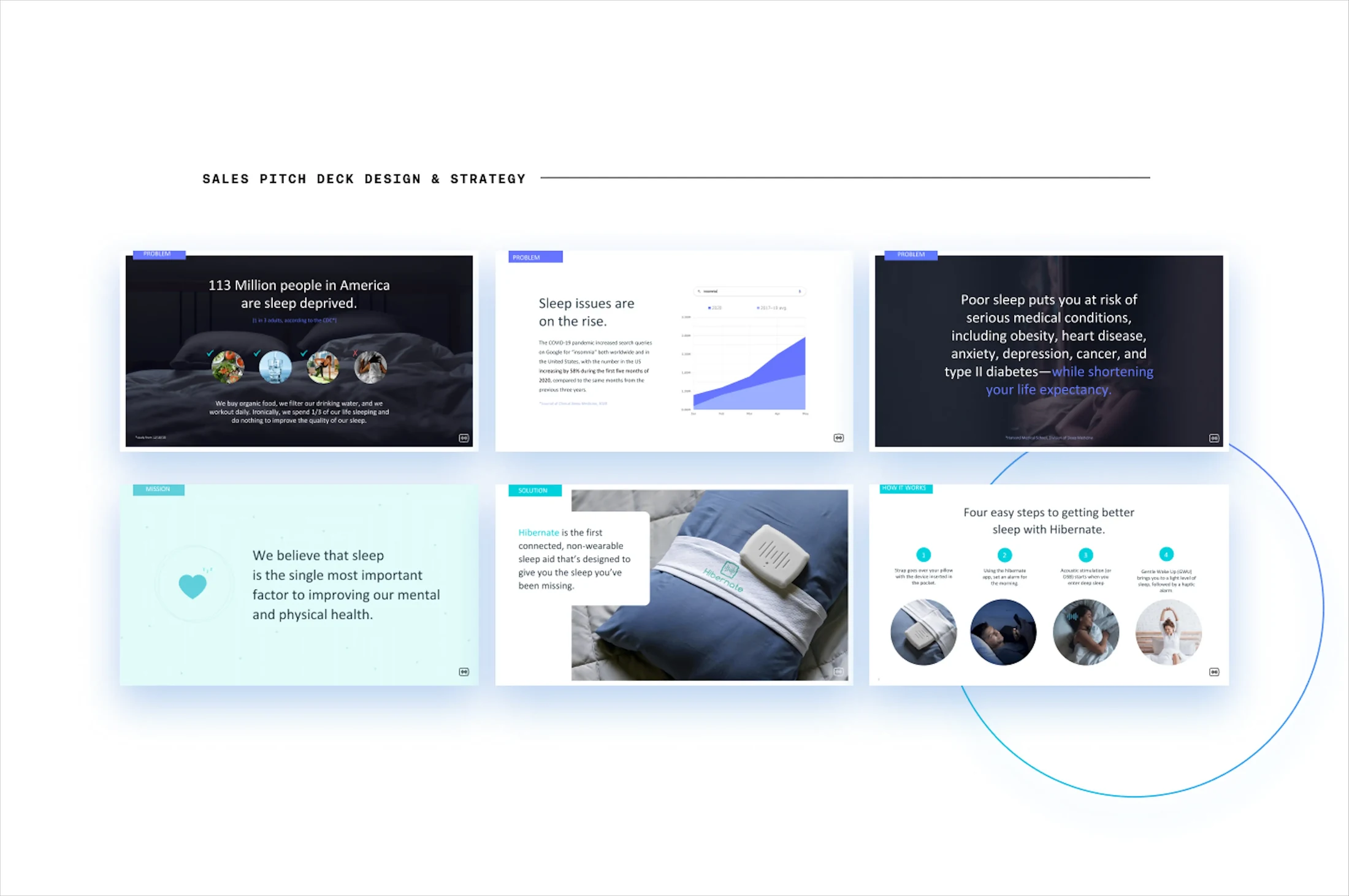
I applied the new brand across every customer-facing surface: product packaging, website, investor pitch deck, and social media. Each touchpoint reinforced the same story.
I was very happy with how the team accurately captured the Hibernate brand messaging personality. I would love to work with the team going forward.
Next case study: The Home Depot