Jordan Campbell · Director of Product Design & AI Operations at Inbox Health
Data Transaction Token
A token explorer for Scroll, from competitive scan to public beta.
Vice President, Creative Director · 2018-2019 · Scroll · SoluTech
Scroll's token needed its own block explorer. A block explorer lists every transaction on a chain, and the ones in use at the time were written for developers. I was Vice President and Creative Director. I designed the interface and the experience, and I worked with the development team while they built it in React. The schedule was short, so the way I got to a direction was unusual.
Results
- One page for the contract address, escrow, supply, holders, and live transactions.
- Shipped as a beta whose own welcome note said the finished explorer was still ahead.
- Audit Explorer and Ledgers were designed as tabs and left for later releases.
The difficult part
What shaped the work
The schedule was short, so I skipped low fidelity. I assembled screenshots of interfaces that already existed into one mockup to show a direction, then moved straight to a high-fidelity design once the key players signed off. The token was also renamed from SCRL to Data Transaction Token during the work, so the screens carry both names.
Who I worked with
I worked with the development team while they built the explorer in React, and with researchers and project managers to keep the design inside the development scope. A lot of the work was settling what the interface would do against what the build could carry. I ran design critique frequently at SoluTech.
The Problem
Block explorers were written for advanced users
Cryptocurrency and blockchain work depends on a tool called a block explorer, which lets people view every transaction on a chain online. Etherscan, Ethplorer, and BlockExplorer are examples. They catered to advanced users, and design usually lost to function.
The Goal
A custom explorer for one token
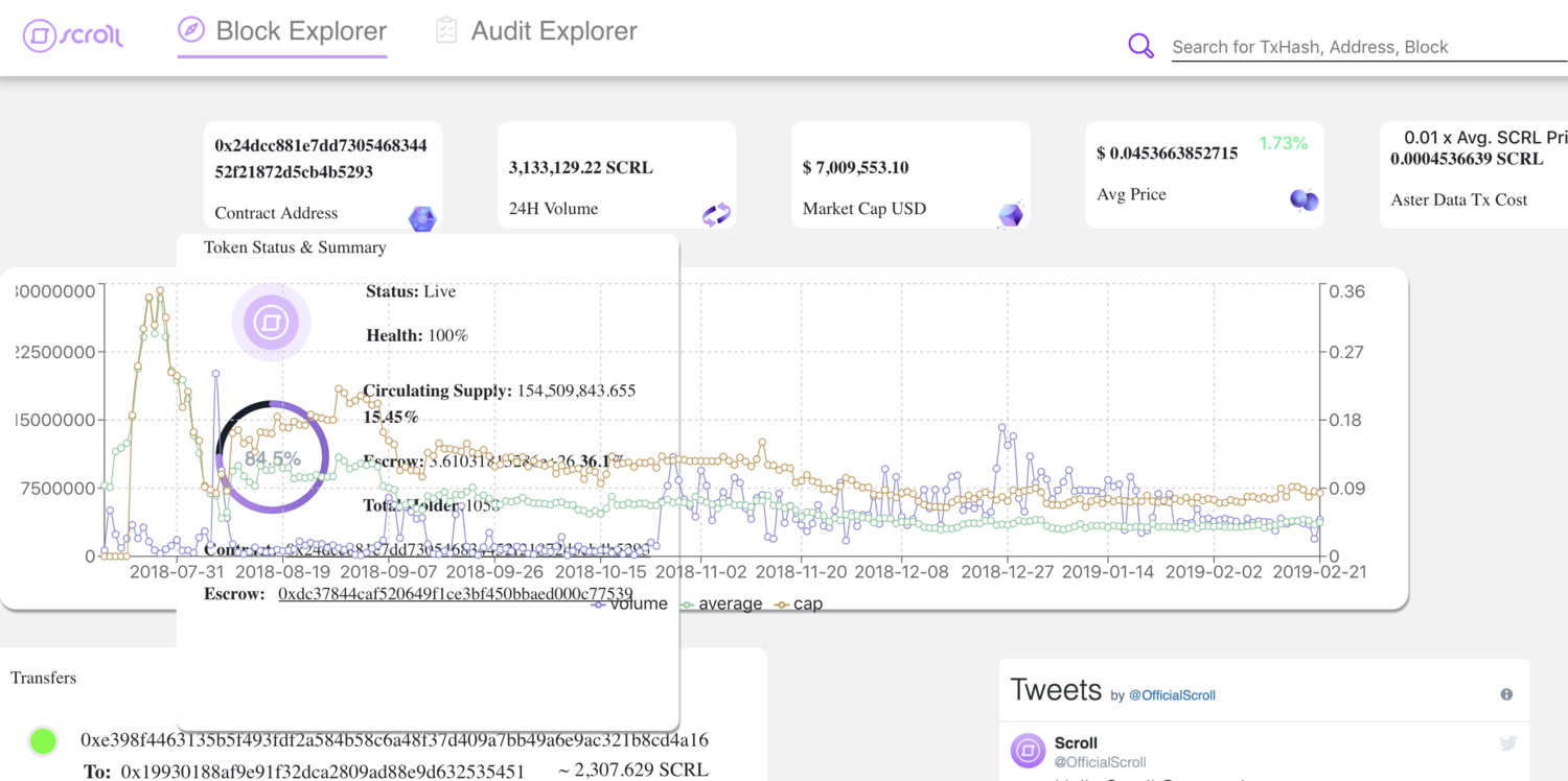
The goal was a custom explorer for Scroll's Data Transaction Token that reached past developers to a broader audience. The token was called SCRL first and was renamed to Data Transaction Token later, so the screens below carry both names.
My Role
Hands on the interface, close to the build
As Vice President and Creative Director I was hands-on with the design of the interface and the experience. I worked with the development team so the site held together for the person using it, and with researchers and project managers to keep the design inside what the team could build.
The Design Process
Skip low fidelity and assemble a direction
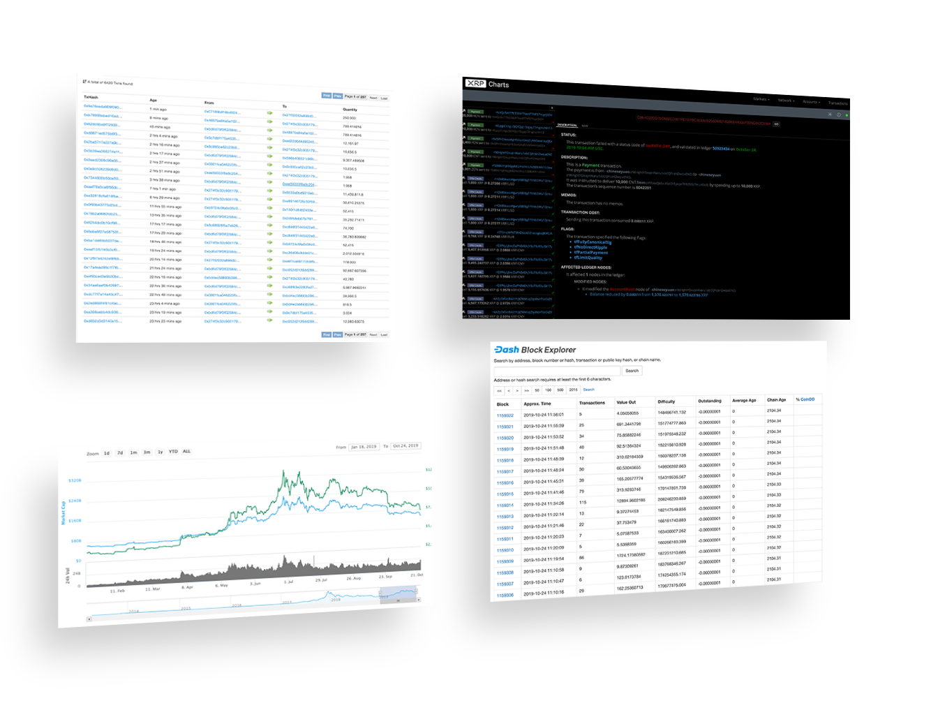
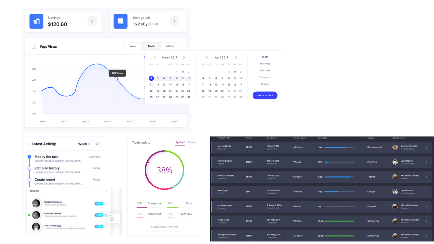
I started with UI research on block explorers including Etherscan, Dash, and Tron, then looked at dashboard interfaces on other platforms for layout ideas. To get to a mockup quickly I used a technique I call Frankenstein-ing: I cut pieces out of interfaces that already existed and arranged them into one picture. After the key players signed off on that direction I went straight to a high-fidelity design, because there was no time for a middle step.
What It Had To Do
The requirement list behind the layout
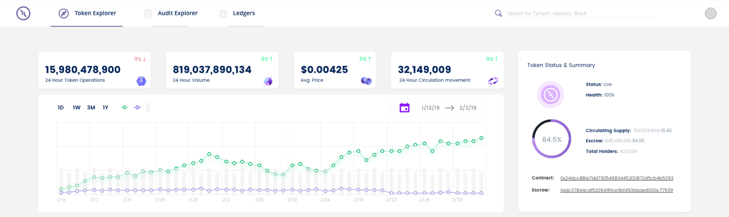
The explorer had to show the contract address and the escrow account address, live stats, circulation movement published every 24 hours, a live escrow tracker, transaction addresses and total holders, transaction status and live transactions, times in EST, a volume graph, paging, sorting by token quantity, address, hash, and date, and a visual indicator for each transaction phase.
Building It
Design next to a React build
I worked with the development team while they built the explorer in React. Much of that work was agreeing on what the interface would do against what the build could carry, and then fixing the screens as the real data came in.
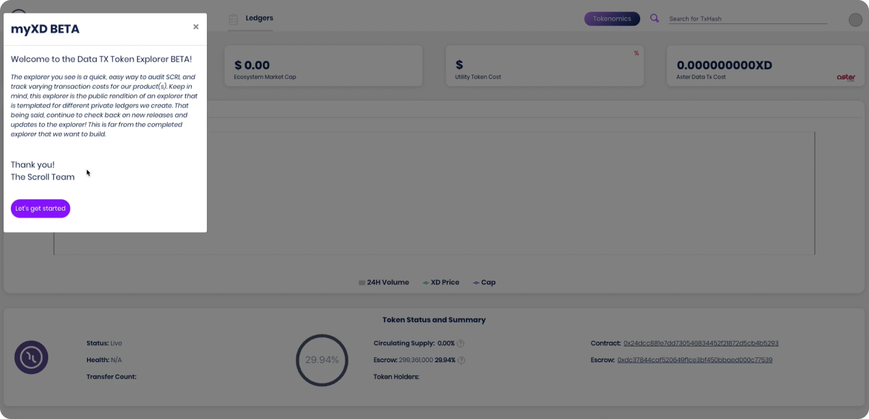
Where It Landed
One page, and two tabs left for later
Someone holding the token could open the explorer and find the contract, the escrow, the supply, the holder count, and the live transaction list in one place. Because the records are on a chain, every interaction was published there. The Audit Explorer and Ledgers tabs were designed for legislation, finance, and regulatory readers, and for token forks, tracked addresses, and supported main nets. Those were planned for later releases, and the beta note in the product said so.
What I Took From It
Working alongside a build
This project taught me a lot about working with a development team, making compromises, and still getting a usable experience out the other end. My time in blockchain and crypto was not an easy one. It included an ICO we ran ourselves, other blockchain and data projects, executive management, and investor management in front of a public audience.
Decision record
Skip low fidelity and assemble the direction from interfaces that already existed
The schedule was short, and the team needed something concrete to react to before I spent time on a high-fidelity design.
- Low-fidelity wireframes first: Slower, and harder for people outside design to judge.
The decision: I cut pieces out of existing dashboards and arranged them into one mockup, a technique I call Frankenstein-ing, then moved to high fidelity after sign-off.
Outcome: The direction was agreed in one pass. The assembled picture is other people’s interface work, so it stayed a discussion tool.
Next case study: Carrier LYNX