Jordan Campbell · Director of Product Design & AI Operations at Inbox Health
Carrier LYNX
Designing a quality-assessment workflow with Carrier, its users, and the people building it.
Associate Creative Director, XD → Design Lead, Brand Experience · 2021-2023 · Digital Surgeons · Carrier · AWS
A temperature excursion meant a quality team had to pull data from more than ten sources before anyone could say whether the product was still good. Carrier put that work at one to five days. I led the product design and the user research, and I designed the workflow that replaced it. The technology underneath changed partway through.
Results
- Excursion evaluation: days → 15 minutes, per Carrier’s own materials.
- The flow I designed took the process from 7 steps → 4 for a person, with the rest automated.
- Carrier’s own projection, not a measured result: 60-80% lower assessment labor against its $1M+ annual baseline.
- Carrier’s own target, not a measured result: 10 → 1 systems used in quality evaluation.
- In testing, 3 of 4 Amgen quality specialists finished their first evaluation unaided; the fastest took 11 minutes 15 seconds.
The difficult part
A mid-project change
A third-party vendor came in partway through and introduced the technology underneath the product. I worked with that vendor and with Carrier’s team, and we carried on designing and building the workflow while that change went through.
Working as consultants
We were consultants, so part of the job was coordinating across four organizations. I worked daily with Carrier’s product manager and engineers. I ran the research sessions with users. I mapped the process steps with AWS. Carrier’s Foundry team owned the Verge Design System, and I extended it rather than replacing it. Platform and product questions were still open while we designed, and nothing here presents them as settled. I also managed a junior designer on the Carrier work for about a year, coaching craft and career, and I ran design critique frequently.
The problem
Deciding what an excursion meant took one to five days
Quality teams needed to determine what a temperature excursion meant for a pharmaceutical shipment. Assessment was manual: gather data from 10+ sources, investigate the excursion, and decide what happened next. Carrier described that work as taking one to five days. The QA research described a burden of gathering documentation, delays to product release, and coordination with supply-chain teams.
Research
I talked to the people who make the call
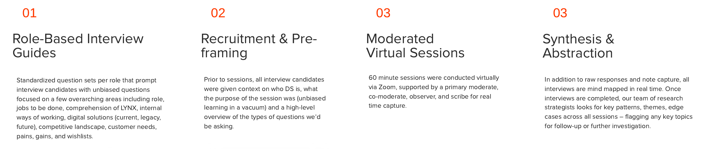
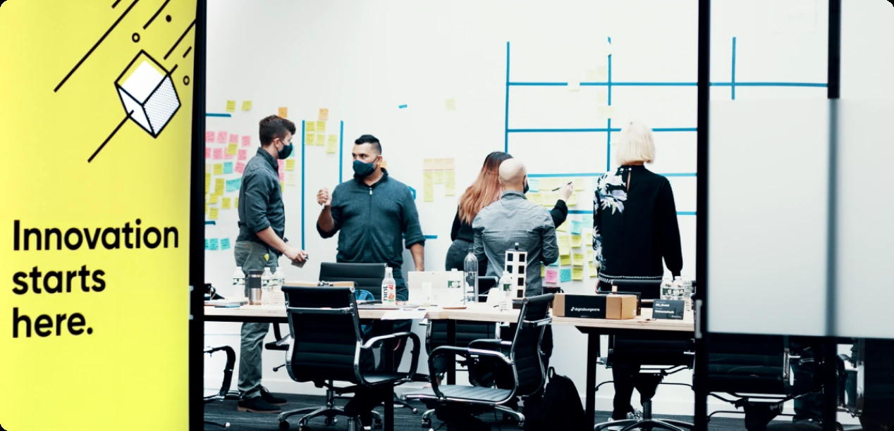
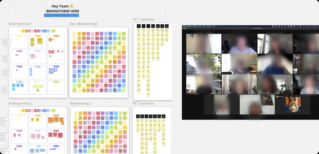
I conducted hands-on research with users alongside workshops and interviews. The research covered logistics and quality-assurance work: what people needed to know, where information lived, and who they needed to involve. Moderated sessions and synthesis maps made the investigation visible across roles, including the exceptions that a simple screen flow could miss. Listening sessions with more than 40 Carrier clients and 5 pharma companies shaped the product direction.
Process Design
Seven human steps, and which three could go
Before we chose anything to automate, we drew what people actually did. The manual map ran to 27 boxes between start and finish, including one that reads “double check calculation manually”. Then I drew two future-state flows next to each other. One left seven steps for a person. The other left four, and the system took over the rest.
Flow 1, seven steps for a person: receives email to assessment; uploads TempTales to CCM; reviews decision and attaches paper documents; assigns to QA; reviews and approves decision; receives summary report; sends to end customer and updates IRT.
Flow 2, four steps for a person: receives email to assessment; uploads TempTales to CCM; reviews and approves decision; updates other systems as required. The system sends the summary to the customer and supply chain.
Two automated blocks, labelled “Marvel Magic” in the design file, sit between the human steps in both flows. The map below is redrawn from my own process map.
The shape we drew
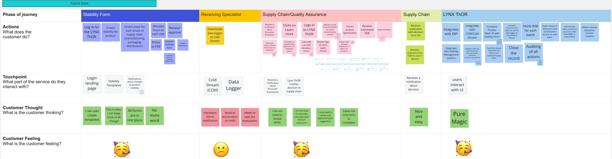
Five phases, and what each role touches
The future-state map spread the work across five phases and named what each role touches. It is a working map from 2021, so it records what we planned at the time.
Opening an event
Everything the old way gathered by hand
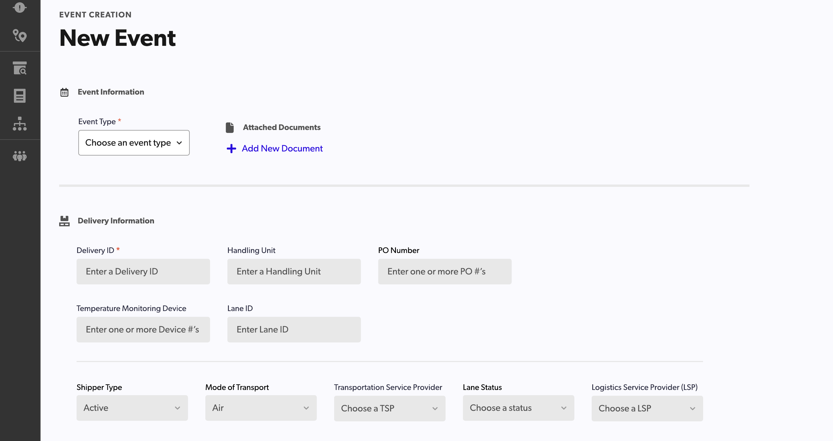
Opening an event was a typing job. Before any temperature or product data, the form asked a person for a delivery ID, a handling unit, purchase order numbers, monitoring device numbers, a lane ID and five transport fields. No frame in the design file opens an event automatically from a monitor feed, so I am not claiming one.
Moving the event
One event, four statuses, one owner at a time
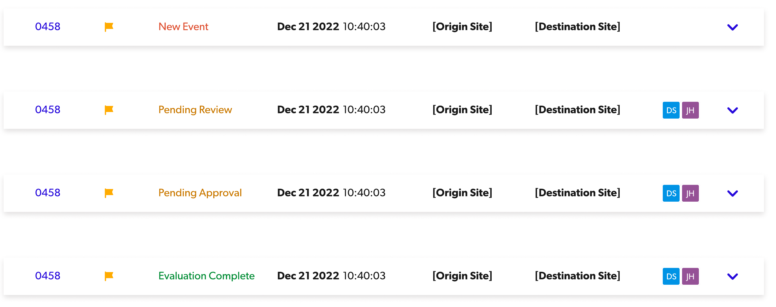
One event walks four statuses, and an owner is attached from Pending Review onward. I designed the row so the status, the assessment due date and the owner read in one line, because that is what a quality team scans a queue for.
The assessment
The system states a verdict and shows its working
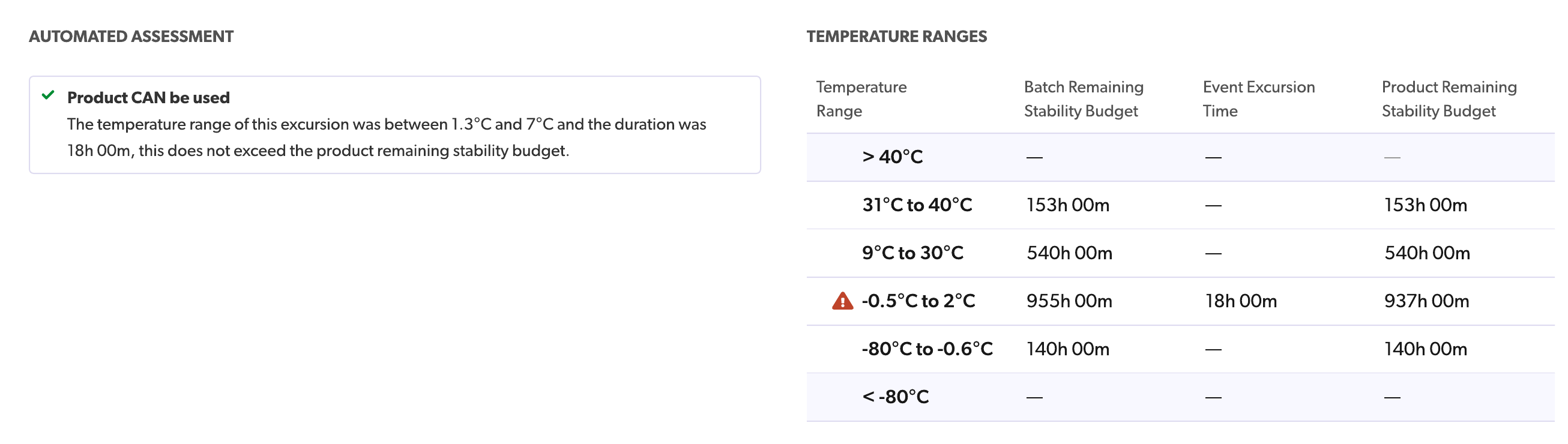
The assessment answers the question and shows how it got there. The verdict sits on the left in one sentence. The stability budget behind it sits on the right, band by band, with the breached band flagged. A reviewer can check the reasoning without leaving the screen.
Recommendation and decision
Separate boxes for the generated answer and the human answer
I kept the generated answer and the human answer apart. The Recommendation panel reports what the stability data says and labels itself as generated. Product Decision and Excursion Review ask the person the question and give them the buttons. A reader of the record can always tell which answer came from the system.

Design system
Built on Carrier’s Verge, extended for this work
I worked within Carrier’s existing Verge Design System, built by their Foundry team. I extended it with custom components for monitoring and evaluation. My role connected the research and workflow design to the interface; Carrier’s Foundry team owned the existing system. The row component and the three assessment panels above are pages out of that system.
Result
Days → 15 minutes, per Carrier’s own materials
Carrier’s own materials put the automated assessment and evaluation at 15 minutes. The manual version took one to five days. The move from seven human steps to four is my design outcome, and it comes from my own process map. Two more figures come from Carrier’s business case. Carrier put the manual assessment at over $1M a year in labor and projected 60-80% lower labor from automation. Carrier’s materials also set a target of taking the systems used for quality evaluation from 10 to 1. Both of those are projections by Carrier, and I have no measured result for either.
The measured result came from testing. I iterated the evaluation prototype through 14 versions. Then 4 members of the Amgen team who perform quality assessments tried it. 3 of 4 completed an evaluation the first time they saw the interface, unaided, and the fastest took 11 minutes 15 seconds.
They truly act as a small army with super powers.
Decision record
Map the whole process before choosing what to automate
The investigation crossed people, data sources and handoffs. Automating one step on its own would not have helped, because the delay sat in the handoffs.
The decision: I mapped the steps with AWS, and we marked the ones that could be removed.
Outcome: The current state ran as seven human steps. The flow I designed left four, with the rest handled by the system.
Next case study: McDonald's SMART Request